A unique series from a unique watchmaking studio
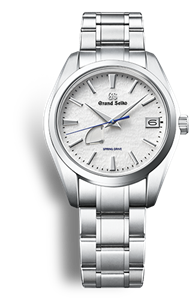
A new design for a new era
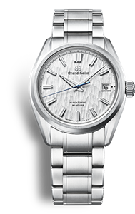
Breathing new life into tradition
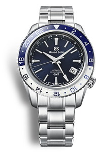
Designed for those who love sport and aim high
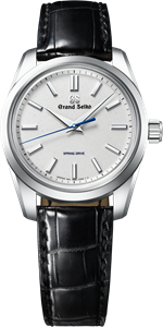
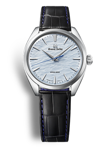
Contemporary elegance for exceptional occasions
There is the possibility that the page you are looking for does not exist or was moved.