來自Micro Artist Studio的傑作
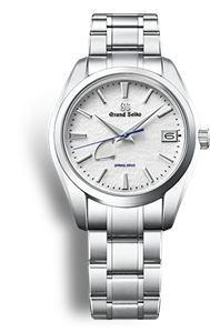
新時代的全新設計
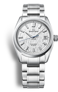
為傳統注入新的活力
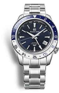
專為運動而生
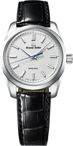
正式場合的現代優雅
There is the possibility that the page you are looking for does not exist or was moved.