![]()

Kiyotaka Sakai(Grand Seiko watch designer)
A new design that emits
a quiet radiance
Watch Design
The spirit of TAKUMI
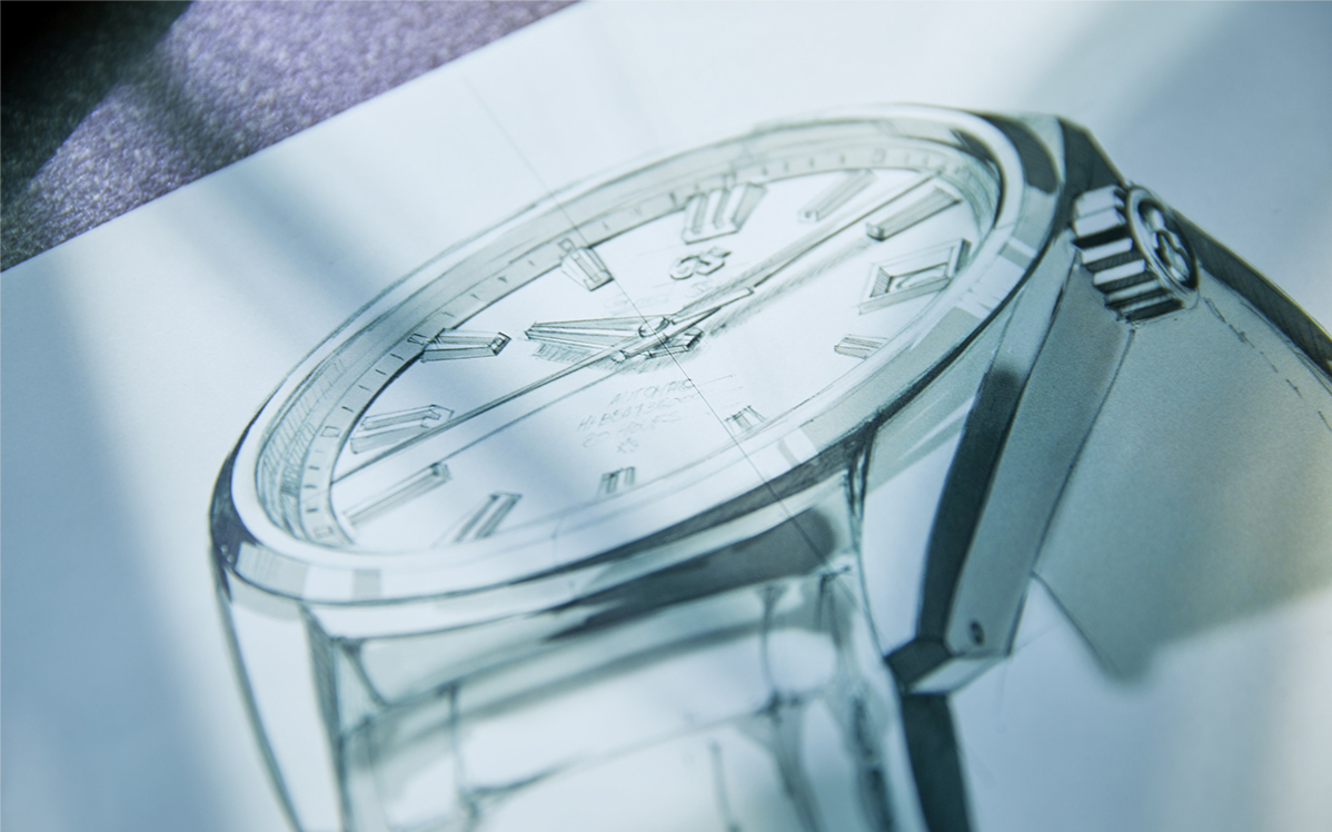
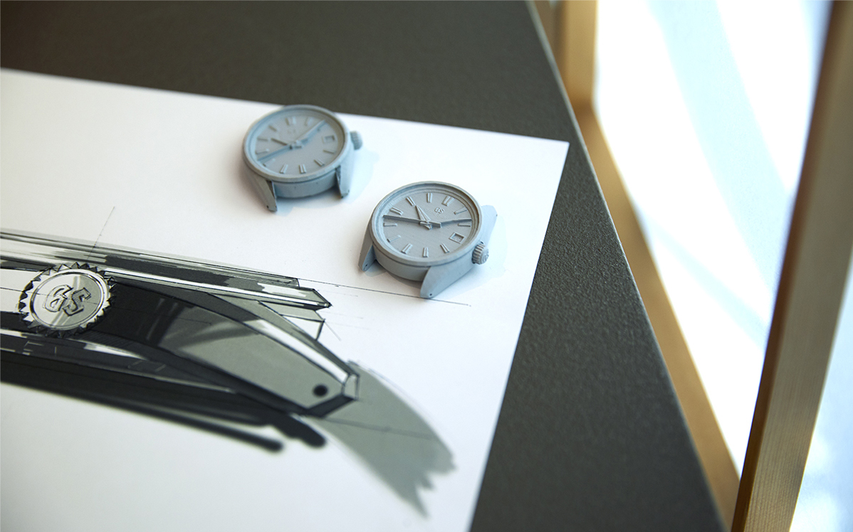
In 2020, a new design was created for the Grand Seiko Heritage Collection. The case has the strong three-dimensional shapes that are central to the Grand Seiko Style and yet a fresh understated look that has a new blend of mirrored and hairline finishing. In addition to making the case thinner, the watch’s center of gravity has been kept low, ensuring a stable fit on the wrist.
“What we saw as our themes were inheritance, evolution and deepening. To design a ‘near-future face’ appropriate for a new generation while inheriting the Grand Seiko traditions that our predecessors have built up, that was our goal,” says Kiyotaka Sakai, the creator of the new design.
A fresh look with eternal values
The Heritage Collection reveals both the roots and the soul of Grand Seiko. At its core are two design series that are emblematic of Grand Seiko, the modern re-interpretation of the 44GS and the design that housed the first Caliber 9S twenty years ago. Both were created by veteran chief designer, Nobuhiro Kosugi.
Why try to re-design a watch that has so proudly stood the test of time? Sakai explains what inspired him.
“Since their creation, the 9S mechanical movement and the 9R Spring Drive movement have both undergone remarkable evolutions, thanks to advances in manufacturing technology and craftsmanship. Over two decades, people’s lifestyles have also changed considerably. I wanted to evolve the design of the Heritage Collection just as the movements have evolved, taking into account the historical background and the values of the modern age. It’s an idea that came to me without my knowing it, and it gradually grew stronger.” It was in 2017 that Sakai began to work on the new design concept. In order to grasp the background of the time when his mentor and friend Kosugi’s design was created 20 years ago, Sakai first immersed himself in the lifestyles of people at that time.

“In Japan and elsewhere at that time, cars were shinier, suits were more dressy and things with a glittery charm tended to be popular. Watches were also mainly worn in formal situations like at the office or parties. Looking from a broader perspective, people at that time were more strongly inclined to value collective consciousness. Whatever the age, there are as many values as there are people so that statement is too sweeping, but it was an age when more emphasis was put on how to fit in with those around you, than on strongly asserting your own opinions. Over two decades have passed since then, globalization has progressed, and whether it’s something you wear or need for your daily life, items that have a simpler and more sophisticated design with only necessary functions tend to be preferred. Individuals have begun to think more independently about everything, and there are a growing number of people who value only the ways of life they have chosen themselves. Even the outfits that they wear to work won’t all be the same: some will be in suits and some won’t. Rather than sitting at a desk working all day, they are active in more multi-faceted ways. These changes mean that the settings in which a watch is worn also naturally change, and it is predicted that this will continue to expand even more as the speed of change increases. Looking ahead to the future, these are the ideas that I felt should inspire the next design of Grand Seiko. I have etched it deeply into my mind that this is the mission that was assigned to me.”
Creating the new face of Grand Seiko for the next 60 years
As Grand Seiko reached its sixtieth anniversary, Sakai and his colleagues faced a special challenge as they sought a new design direction. They fully realized the significance of the moment and the obligations that Grand Seiko’s long history imposed but were determined to look ahead as much as they wanted to respect the past.
“The aim was to create an ‘impressive look.’ In an era where an individual’s way of thinking and behavior are more valued, I thought we needed a design that announced the presence of the person wearing the watch. You could also say it’s like a unique aura that surrounds the watch. I moved ahead with the design, conscious of embodying that kind of special charm.” Sakai continued his ever deeper investigation into the many designs that have, together, defined Grand Seiko over six decades. Of course, the first Grand Seiko loomed large. “The hour and minute hands of the first Grand Seiko are distinctive, but what I had my eye on was the sharp balance between the hour and minute hands: the thick, bold hour hand contrasting with the long and slender minute hand. With the new design, I wanted to further deepen this balance to achieve even greater visibility.”
Radiance and serenity
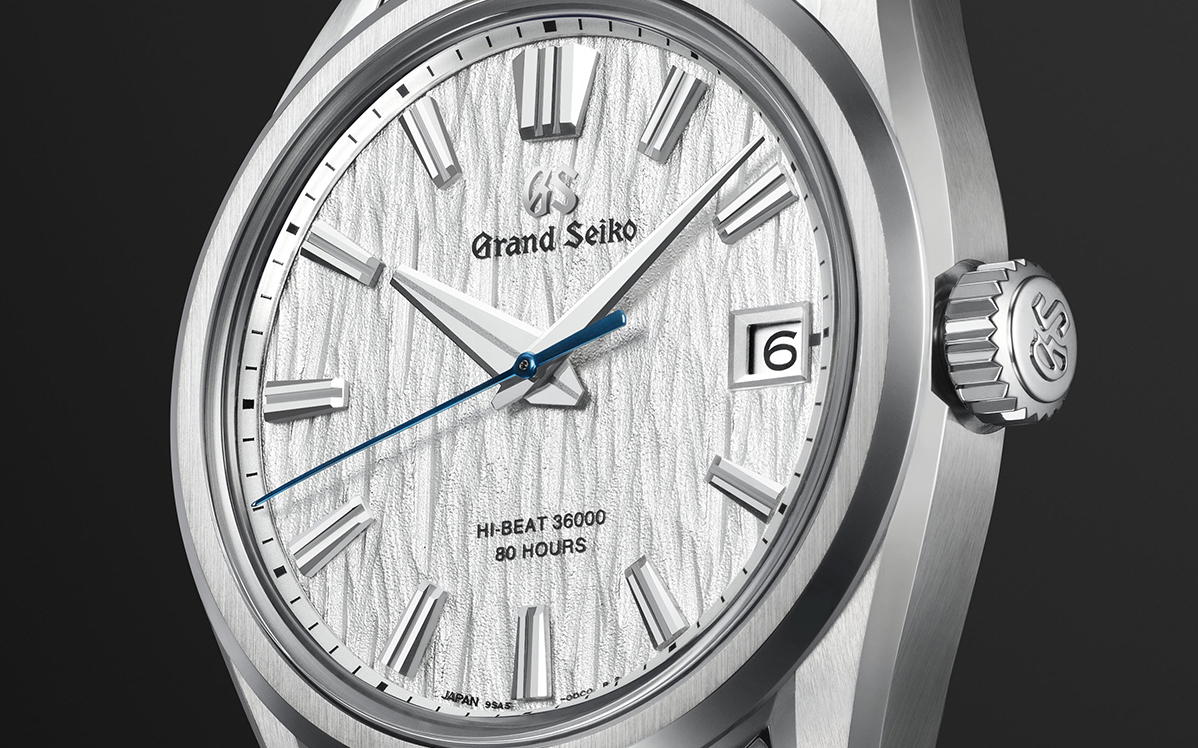
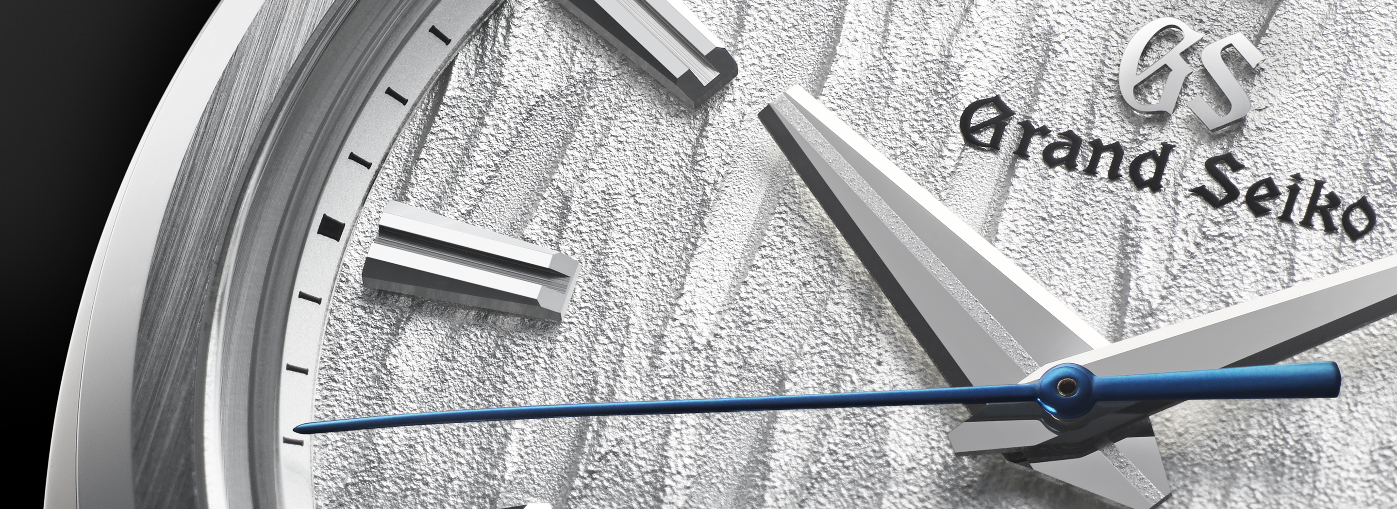
To create a lasting design idea for Grand Seiko whose very essence involves exploring the optimum balance of light and shadow, Sakai believed that he should seek for a look that was radiant but in a serene and not glittery way. He focused on subtle hairline surfaces that offered a deep, soft warmth.
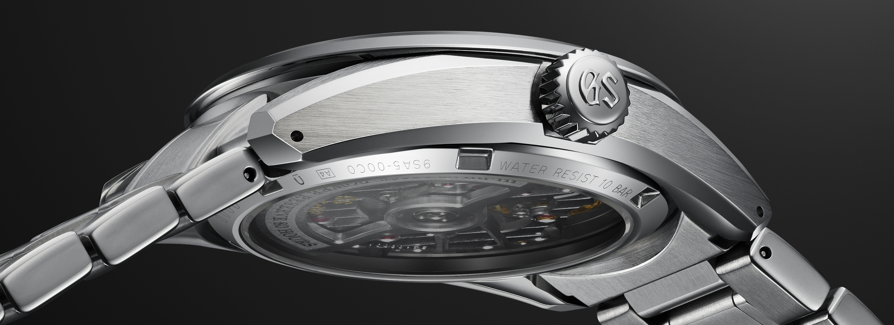
“I felt that a serene radiance and sporty impression could be given to the watch as a whole by making full use of the matte texture peculiar to hairline. In the new design, a hairline finish is applied to components including the side of the watch case, the upper surface of the bezel and the upper surface of the lug, and, by partially incorporating a mirror surface, the beautiful edges stand out and create a sharp impression while retaining an understated charm overall. Since the expression changes greatly depending on where and how the hairline and mirror surfaces are arranged, we carefully balanced the design as we proceeded. In other words, it could be said that how you control the way the mirror surface is placed was the key to making the most of the hairline. By suppressing the light, the serene world view of the hairline surface is enhanced, and with the creation of greater expression in the contrast between light and shadow, a design emitting a profound radiance is achieved.”
A strong case that sits well on the wrist
As he sought to realize his idea, Sakai had a great advantage in the availability of a new movement with a slim profile. He sought to make the most of this opportunity.
“We greatly reduced the reverse bevel of the case side and, by making it into a straight, wide vertical surface, we gave depth to the case side and a shape with a strong presence. If a movement is thick, we often devise ways to make it look thin, but this case hasn’t been designed to look thin. This is a slim case shape that was made possible precisely because the movement has been made thinner.
From the steep vertical surface of the case side, the upper surface of the lug with its gentle curve, and the lug with a sharply cut off tip, we have achieved a case shape that is firm and light.”
Sakai also wanted to make his new watch a joy to feel on the wearer’s wrist. Comfort and stability were his aims.
“In aiming for a watch suitable for all situations, it was essential that it had a greater feeling of stability and sat extremely well on the wrist. The key to achieving this is the position of the watch’s center of gravity. When the movement is thick, the center of gravity naturally becomes higher; conversely, the thinner the movement, the lower the center of gravity can be. With the design, we took advantage of the slimmer movement and made the back cover as thin as possible, allowing us to lower the center of gravity to the maximum extent. Furthermore, by widening the lug width to 22mm in respect to the 40mm case size, we made the watch more stable in the horizontal direction and achieved a better fit to the wrist.”
A dial design with high visibility and the stature of Grand Seiko
“We wanted to maintain a balance between the hour and minute hands and greater visibility. Learning from the sharp balance of the hands on the first Grand Seiko, I made the hour hand as thick as possible and the minute hand long and slender. The result was pleasing. We improved the dial’s visibility.” Sakai also increased the width of the indexes in line with the thickness of the hour hand.
“To make it easier to read the time, the printed line that passes through the center of the hour hand and the groove cut surface in the center of each index have been made the same width. The reason we ventured to make the hour hand tip into a cut-off shape was to make the hour hand as thick as possible. The connecting of the groove at the center of the index and the printed line of the hour hand increases accuracy and visibility. Consideration has also been given to the minute hand for ease of reading. The tip of the minute hand has been bent and brought as close as possible to the minute track. The 12 o’clock index is an important part of the Grand Seiko signature. Normally, the index at 12 o’clock is a shape with twice the width of the other indexes, but is that the right look for Grand Seiko in the future? Thinking about it again brought me back to the ‘impressive look’ I had set as my goal. The 12 o’clock index, with its symbolic shape that makes the model recognizable at first glance, makes it easier to read the time, thus preserving the foundation of the Grand Seiko Style. This led me to the conclusion of that the 12 o’clock index should have greater presence and approximately 2.5 times the width.”

A spirit of design that will be passed down the generations
Ever mindful of the ideas that have inspired Grand Seiko since its inception, Sakai’s aim as a watch designer is “pursuing what a watch should be as a tool. This is something I learned from my seniors and am always keeping in mind. In designing a Grand Seiko that places importance on long-term usability, we designers have to keep in mind what our predecessors knew all those years ago. They wanted to ‘make tools for those who require them.’ Also, when asked ‘Why do you design this way?’ whether it be shaping or whether it be color, I always give a reason to every detail that constitutes a watch. It is also a lesson learned from our predecessors that by thoroughly ascribing meaning, a watch gains depth and gets closer to what it should be.”